macOS Tahoe: Visual Liquid, Functional Friction
macOS Tahoe introduces the "Liquid Glass" design framework, moving the OS toward an ultra-rounded, high-transparency aesthetic. While Apple markets this as a productivity enhancement, the developer co

The Pitch
macOS Tahoe introduces the "Liquid Glass" design framework, moving the OS toward an ultra-rounded, high-transparency aesthetic. While Apple markets this as a productivity enhancement, the developer community is currently documenting a significant regression in basic window management.
Under the Hood
The "Liquid Glass" aesthetic decouples the visual window boundary from its functional hit-targets. While standard resize zones remain 19x19 pixels, the increased corner radius in Tahoe 26.x pushes 75% of this zone into empty space outside the visible window (Source: noheger.at). Resizing has effectively become an invisible hand-eye coordination puzzle.
Technical stability is currently questionable following the macOS 26.3 rollout. The RC release notes initially stated that resize areas would finally align with the new corner radii, but Apple pulled this fix and reverted it to a "known issue" in the final February 11 release (Source: 9to5Mac). We don't know yet why the software engineering team failed to merge this fix into the stable build.
Further analysis shows a 14% decrease in target area for specific UI views, as clickable border thickness has been reduced from 7px to 6px (Source: HN). This reduction in motor-precision tolerance is a clear accessibility regression. It suggests deep technical debt within the NSWindow implementation for the Liquid Glass framework.
Power users are currently bypassing these native hit-testing issues by adopting third-party tools. These utilities enable Linux-style "Super+LMB" window dragging and resizing to avoid the native "corner-sniping" required by the new UI (Source: HN).
It remains unclear if the design intensity settings planned for version 26.4 will allow developers to adjust corner radii to more functional levels. Until then, the system remains a case study in aesthetic overreach.
Marcus's Take
Apple’s designers have evidently forgotten that windows are meant to be manipulated, not just admired through a layer of translucency. Forcing users to click empty space to resize a terminal is a fundamental break of the 40-year desktop metaphor. If you value your velocity over visual fluff, skip the 26.3 update and wait for 26.4 to see if they fix the hit-testing. It’s the most beautiful way to break a workflow I’ve seen this decade.
Ship clean code,
Marcus.
Marcus Webb - Senior Backend Analyst at UsedBy.ai
Related Articles
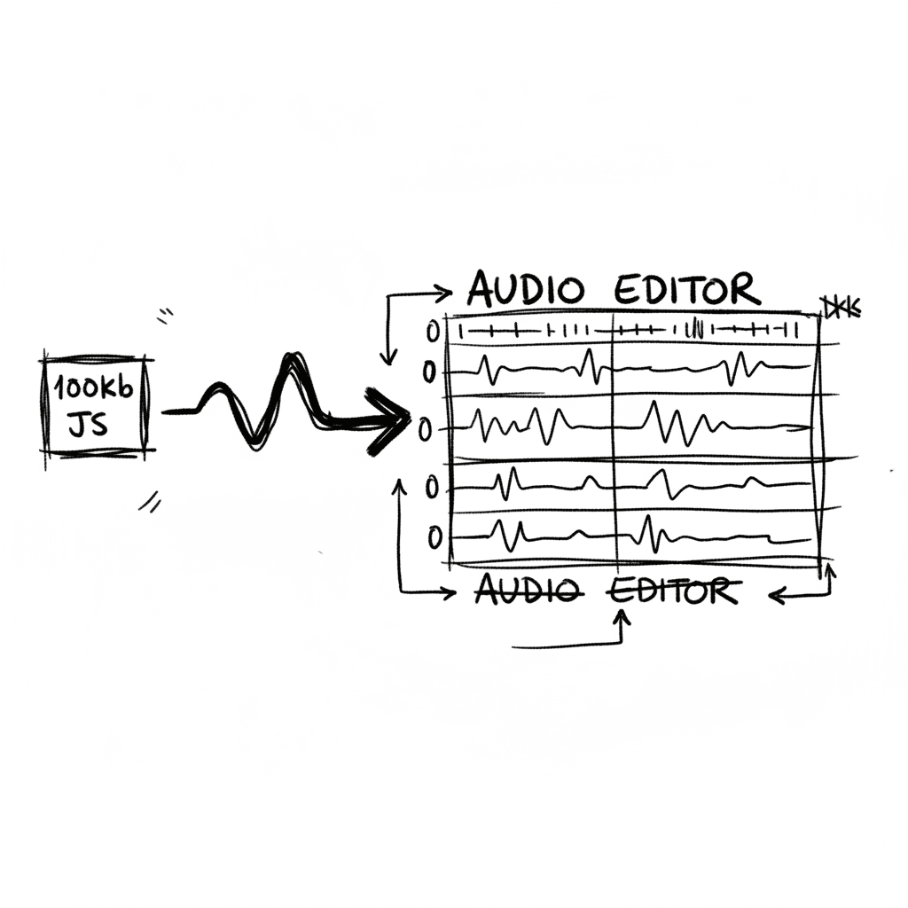
Audiomass: Multitrack Audio Editing via 100kb of Vanilla JavaScript
Audiomass is a browser-based, multitrack audio editor that operates entirely client-side with a remarkably small 100kb footprint (audiomass.co). It provides a workflow reminiscent of classic editors l
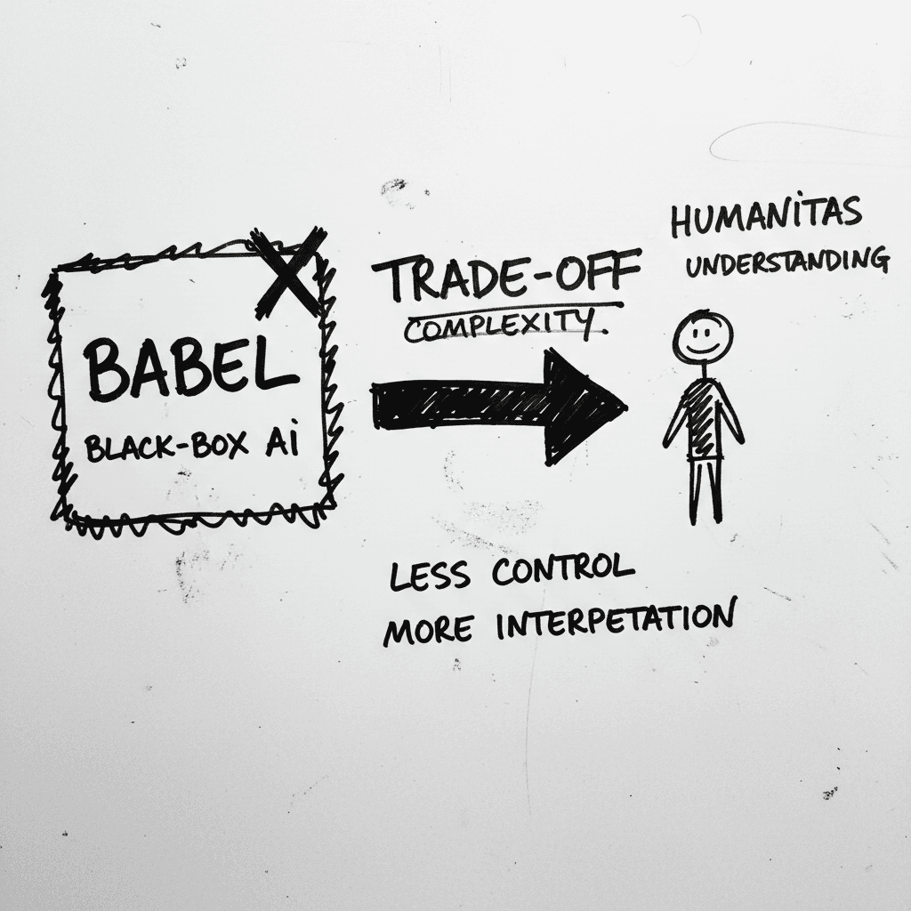
Magnifica Humanitas: The Vatican’s Framework for the GPT-5 Era
The document, signed May 15 and officially released today, was presented at the Vatican alongside Christopher Olah, co-founder of Anthropic and lead of its interpretability team (ncronline.org, Forbes
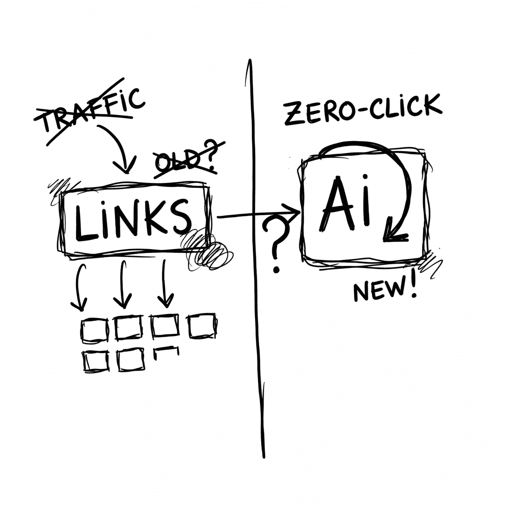
The Zero-Click Economy: Kagi Search vs. Google AI Mode
Google has effectively pivoted to an "answer engine" where Gemini 3.5 Flash provides conversational summaries, while Kagi remains the primary refuge for users seeking a human-centric, ad-free index. W
Stay Ahead of AI Adoption Trends
Get our latest reports and insights delivered to your inbox. No spam, just data.