Measuring Perceptual Boundaries in Hue Classification
The "Is my blue your blue?" experiment identifies the precise hue where an individual’s visual processing shifts from blue to green. Created by neuroscience and AI researcher Patrick Mineault, it uses

The Pitch
The "Is my blue your blue?" experiment identifies the precise hue where an individual’s visual processing shifts from blue to green. Created by neuroscience and AI researcher Patrick Mineault, it uses a binary classification task to map the distribution of subjective color boundaries (Source: Author's public profile/GitHub).
Under the Hood
The engine operates on a forced binary choice model, calculating a "boundary" value that represents the user’s specific flip-point between color categories. This value is then benchmarked against a global distribution of results to determine where your perception sits relative to the mean (Source: ismy.blue site logic).
While the logic is sound from a statistical perspective, the implementation faces significant hardware hurdles. The tool lacks controls for screen calibration, panel type (OLED vs. IPS), or ambient brightness, all of which alter the emitted wavelength. In a browser environment, these variables introduce a high degree of noise into what is ostensibly a biological measurement.
There is also a significant linguistic overhead that complicates the data. The experiment highlights cultural phenomena such as the Japanese 'ao' category, which historically bridges the blue-green divide (Source: HN Comment context). By forcing a Western binary, the tool may be measuring cultural conditioning rather than pure neurological response (Source: HN Comment).
Regarding data lifecycle, we don't know how the collected perceptual data is anonymized or stored. There is currently no public information confirming if this dataset has been leveraged to fine-tune the vision transformers in 2025/2026 models like GPT-5 or Gemini 2.5. Furthermore, there is a lack of peer-reviewed validation linking these web-based results to clinical neurological studies.
Marcus's Take
As a technical experiment, it’s a clever exercise in data visualization, but don't mistake it for a clinical diagnostic tool. The forced binary is a frustrating UX choice that ignores the reality of "teal" or "turquoise" for the sake of a cleaner distribution curve. It’s a bit like asking a compiler to choose between two different syntax errors—you’re forced to pick one, even if both feel wrong. Play with it to understand your own bias, but keep it far away from any production-level UI/UX specs where accessibility and color-blindness standards require actual scientific rigor.
Ship clean code,
Marcus.
Marcus Webb - Senior Backend Analyst at UsedBy.ai
Related Articles
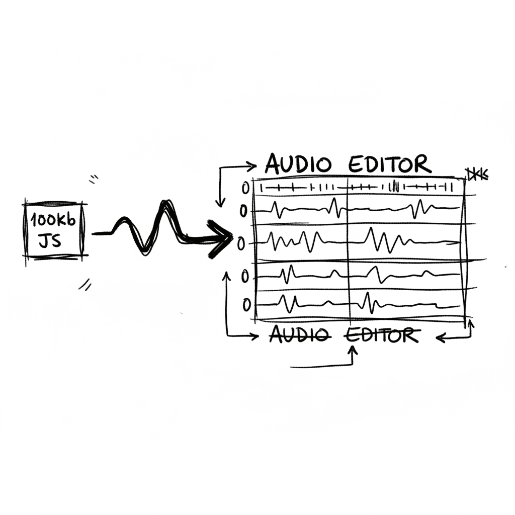
Audiomass: Multitrack Audio Editing via 100kb of Vanilla JavaScript
Audiomass is a browser-based, multitrack audio editor that operates entirely client-side with a remarkably small 100kb footprint (audiomass.co). It provides a workflow reminiscent of classic editors l
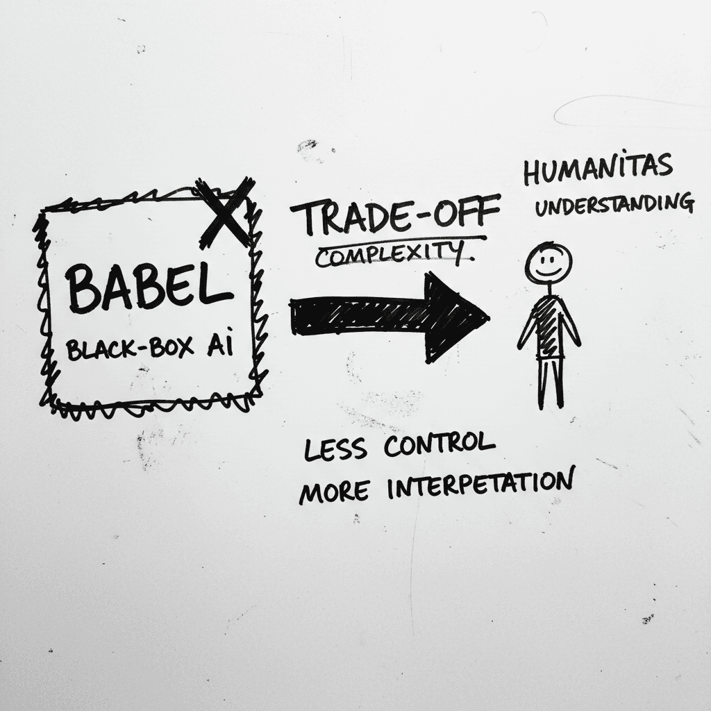
Magnifica Humanitas: The Vatican’s Framework for the GPT-5 Era
The document, signed May 15 and officially released today, was presented at the Vatican alongside Christopher Olah, co-founder of Anthropic and lead of its interpretability team (ncronline.org, Forbes
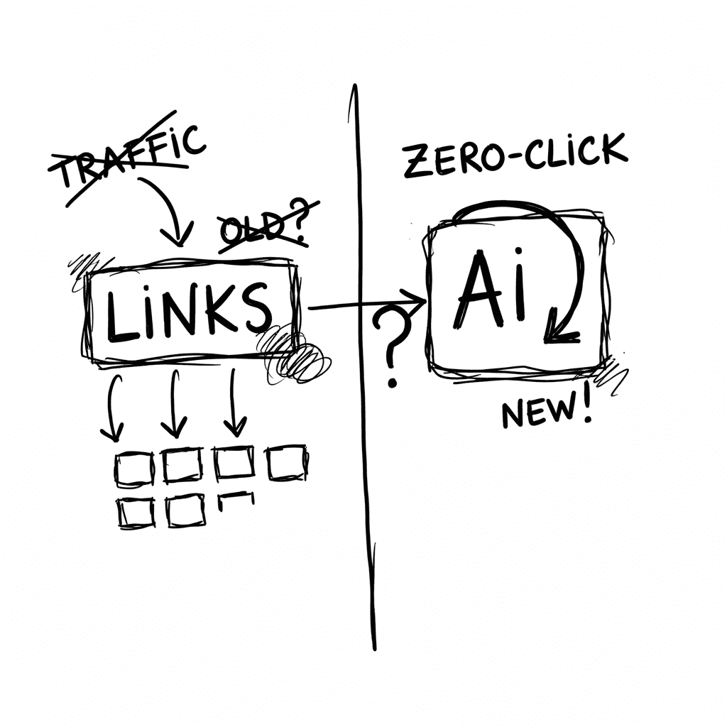
The Zero-Click Economy: Kagi Search vs. Google AI Mode
Google has effectively pivoted to an "answer engine" where Gemini 3.5 Flash provides conversational summaries, while Kagi remains the primary refuge for users seeking a human-centric, ad-free index. W
Stay Ahead of AI Adoption Trends
Get our latest reports and insights delivered to your inbox. No spam, just data.